Welcome to our Dev Spotlight! In this exclusive interview we dive into the creative world of gaming with Drifter’s Lead Environment Artist, Andrew Severson, who is responsible for bringing the game’s virtual landscapes to life. With a brushstroke of innovation and a palette of pixels, this talented individual has played a pivotal role in shaping the immersive realms that players explore in our games. Join us as we uncover the artistic vision, technical expertise, and behind-the-scenes insights that have helped shape our captivating virtual worlds!
Andrew Severson’s background
As a lifelong artist, Andrew found himself laid off from a factory job in 2009 and decided to learn 3D, with a goal of getting into the video games industry. His first project, Halo 4, landed him in Seattle where he has been since. After Halo 4 and 5, he moved into the indie space, and after a couple stops at a few small studios, he reached out to Art Director Kenneth Scott at Drifter, and joined the team in 2017. At Drifter he worked as an Environment Artist, shipping several VR games such as Gunheart and Lies Beneath before becoming a Lead Environment Artist, and shipping Superior: Vengeance.
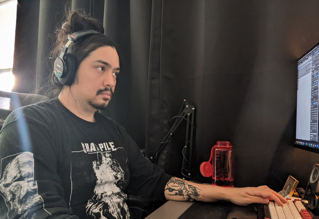
My primary responsibilities are to collaborate with level design while delivering on the visual design vision set by Kenneth, as well as delegating tasks to my team and supporting them in whatever way will help them work as efficiently as I can. I try my best to ensure my team gets to work on things they are excited about, and things that work to their strengths when possible.
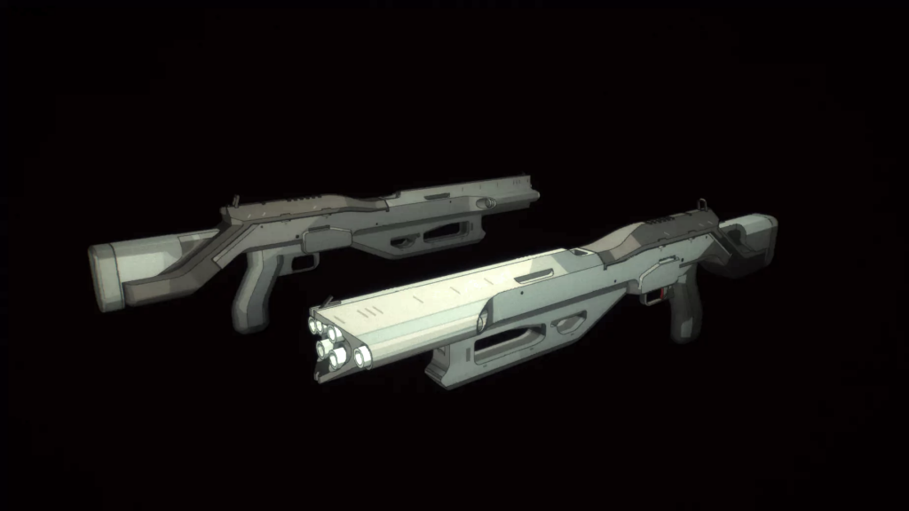
On the art side I will often be doing much of the same stuff the other environment artists are doing. Working with design’s blockouts, we will replace the graybox cubes with arted meshes, whether that be creating new art assets or reusing something from the palette. We are also in there doing lighting, material work, making sure collision is good, set dressing, and outside of environments we are helping with buildings, weapons, and props.
Could you describe the overarching artistic vision you had for the game’s environments and how you aimed to capture the superhero apocalypse theme?
We really wanted to deliver on something futuristic and apocalyptic, but not the familiar overgrown rusty world that we often see tied to that kind of theme.
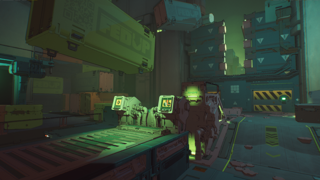
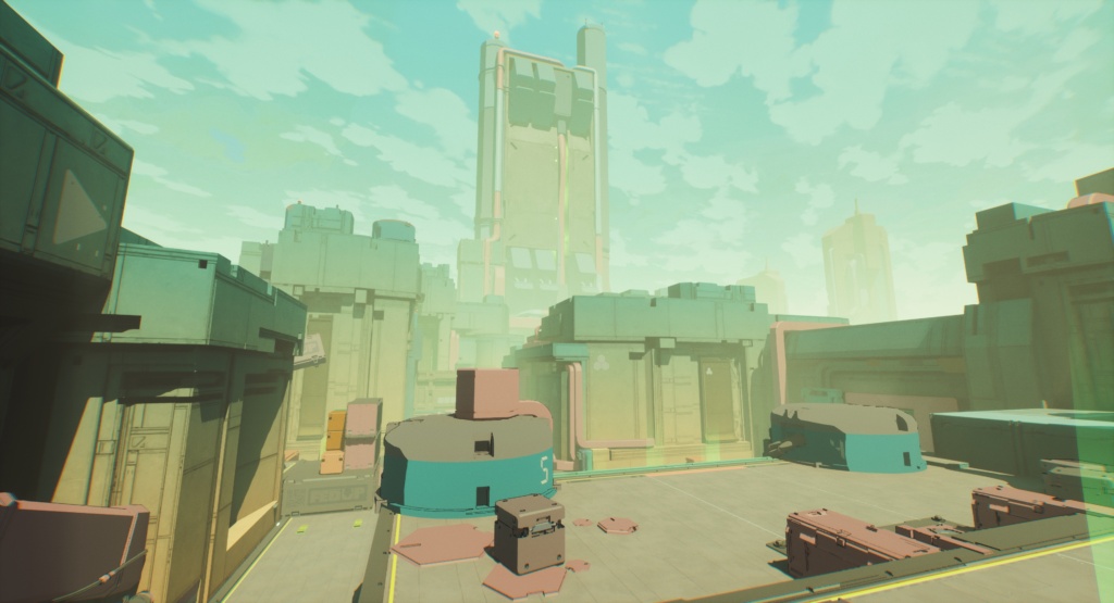
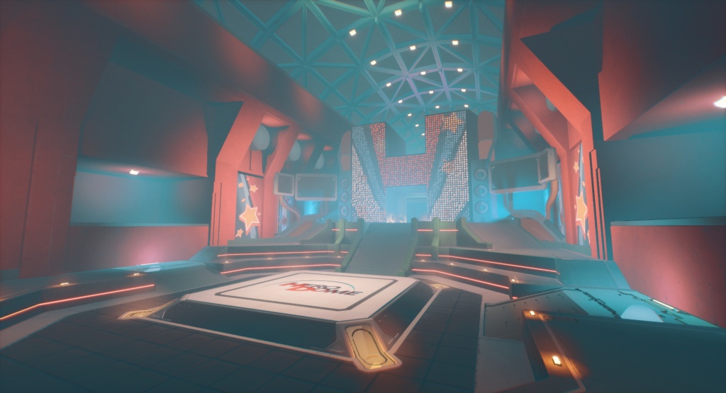
We tried to envision ways that the world utilized superheroes’ powers, and also ways that the world was affected by superpowers from heroes who have gone bad. Some of this was done through us coming up with the idea of corporations that utilize powers for their services, some of this can be seen with the floating cargo containers in the Powerstation map, or the Hero Dome boss arena that I imagined like a professional wrestling ring space, where maybe superheroes held events where fans could watch them fight.
On the other end, some of the maps are meant to be more on the apocalyptic side, where things are more grown over or the destruction is much more prevalent.
In Superior: Vengeance, the maps that players encounter are mostly random from run to run. How did you approach designing environments that could adapt to different playthroughs while maintaining visual cohesion?
One thing was really knowing our visual language and keeping it consistent.
We did a lot of work landing in a space where the environments are primarily using painted textures to somewhat mimic background art in anime, where it is often hand painted and softer looking. We had to balance the use of cel shaded objects in a way that they really pop and help accent other environment pieces. Keeping this consistent across the game helps things feel cohesive and a part of the same world.
What sources of inspiration did you draw from when creating the various environments in the game?
Kenneth and I were both heavily referencing anime and other animated properties throughout development. So much time looking at the painted backgrounds of Akira, Ghost in the Shell, and Evangelion.. Those were also great places for us to look to for industrial/hard surface design inspiration.
The superhero theme often includes larger-than-life structures and landmarks. How did you handle the design and integration of such elements into the game world?
I think often these came from objects that were placed in the blockout process. We would see there’s a large ambiguous shape, usually out of the play space, and we’d brainstorm some ideas of what those could be. Other times we might be working on a map and notice a spot that could really use a large focal point and help draw you towards an area.
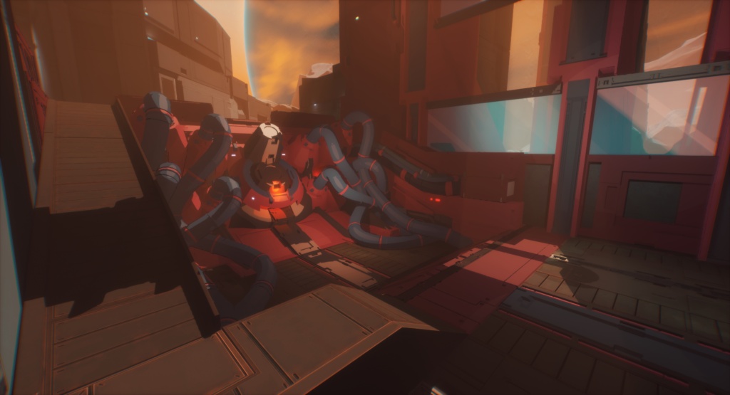
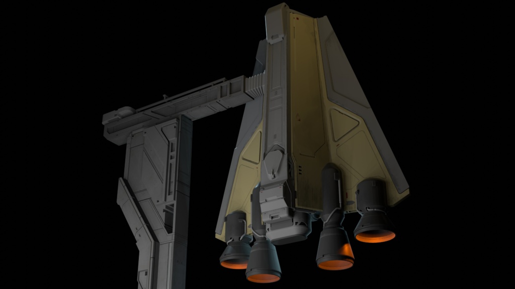
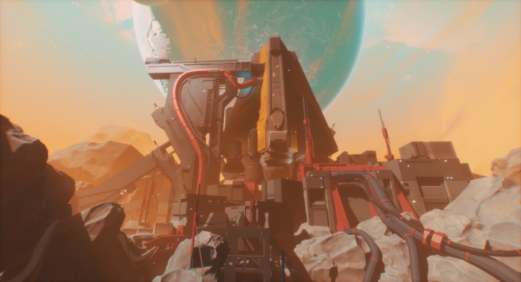
One example would be the large ship hanging over a section of the Offworld map. We always knew we wanted to build a map that was not on Earth. We had many different ideas of WHY humans had gone to this planet but one thing that carried through these ideas was that a large ship would be present. A spot for this was made in the blockout and even a space built to fight underneath the ship. For that I had to think about how the ship was going to be situated that would make sense above the map and how you would be seeing it from different locations and I looked at a lot of references of space shuttle launch pads.
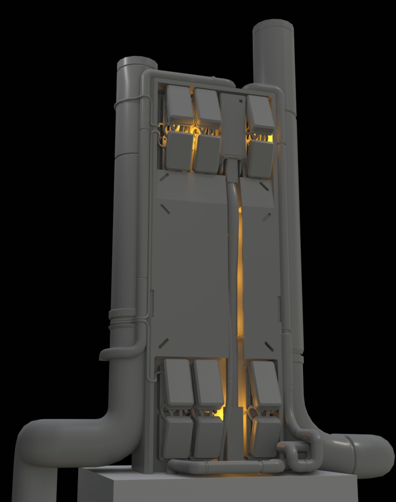
In real life those structures are incredibly complex, and in our game that look would probably be too noisy, so rather than a giant structure of spindly scaffolding, I build something more bulky and armored looking. Going back to our inspirations, I would have these bulky towers like maybe something you’d see in Evangelion, and run some giant pipes and hoses around drawing from Akira.
Were there any specific environmental storytelling techniques or details you included to convey the narrative and enhance the player’s immersion in the superhero apocalypse world?
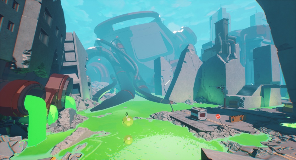
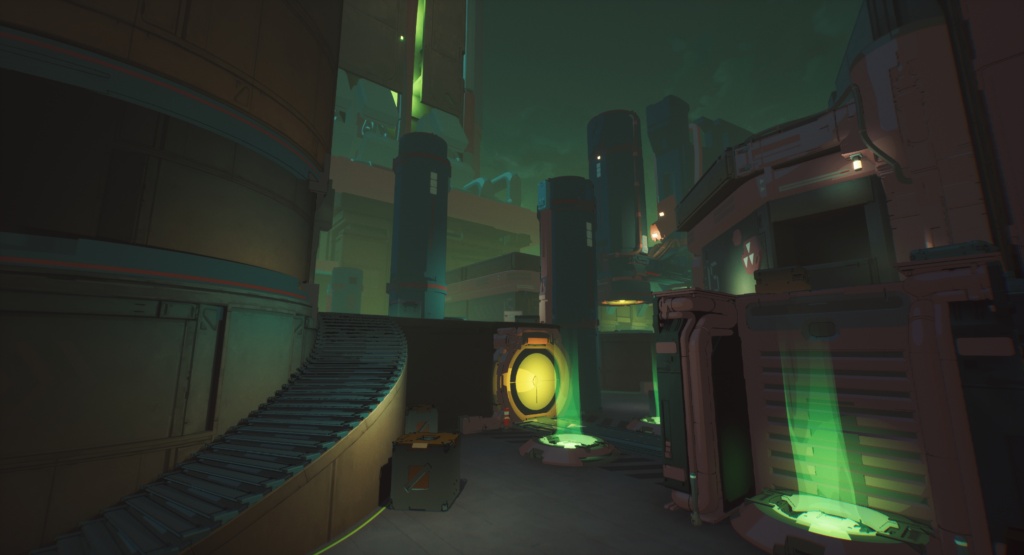
The landmark structures helped a lot with storytelling, often being some kind of mysterious looming thing that the player can speculate on. In the Rubble map there is a large bulbous structure jutting out from the bright green hazardous goo and in our minds we kinda thought of it as this machine of some sort that has risen from underground and flooded the area with the green goo. In another area I put together a building that I wanted to look like a concrete building that has mostly collapsed but there are still structural parts of it present.
Another example is in the Aftermath map, you can see above the playspace there is a raised highway of sorts, and as it reaches the playspace it stops, but on the ground are pieces of the highway that have broken off and fallen. Just beyond that there is a huge concrete wall that divides the map, and that wall has a huge chunk missing from it. Maybe something super strong punched its way through? Oh, and all the meaty goo and giant teeth surrounding the map.
Other techniques are smaller and more subtle, In the alleyway that the player starts in we did things like putting flyers and signs on the walls and trash in the corners, the signs on the stores in the downtown map
In a roguelite game, replayability is essential. How did you design environments to offer varied and engaging experiences in each playthrough?
Most of the maps were designed with 3 major sections that can be used for various missions. Because of this, we are able to have players teleport into the map at different locations for different missions, so you see the map from different angles. Some of the sets we built are best seen when you’re coming from a certain direction, and maybe you don’t even go over to that area for the mission you are on, and you will see it next time.
Balancing gameplay and visuals is crucial. How did you ensure that the environments were not only visually engaging but also functional and conducive to gameplay mechanics?
We had to keep in mind the metrics and sight lines a lot. By metrics I mean there are certain measurements that affect things, for example there is a height that the player can jump without a jump power, so we need some objects that the player can jump onto without a super jump. Beyond that, there’s a height that they can reach to clamber up on, but not land on with their feet. After that there’s a height you can land on when doing a powered double jump. These are all things we consider and test to make sure it works well.
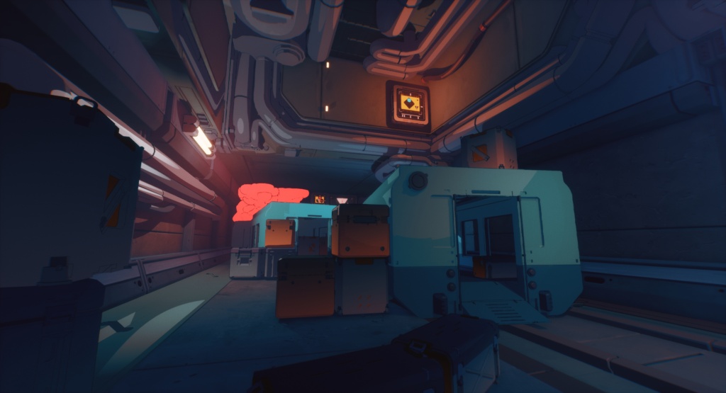
Collision was a big thing to stay on top of. It’s easy to just put a rectangle of collision around a cluster of pipes on the ceiling, but maybe you use that somewhere else as a pillar that the player can hide behind. Now the player is trying to shoot between the pipes, but is hitting the collision. We have to be sure that if you think you can stand on something, if you think you can shoot through something, that the collision will match it visually.
How did you manage the balance between creating open, explorable areas and more linear, action-packed sections within the game’s levels?
I think a lot of that is on the level designer. They have a good idea of how encounters are meant to play out in different spaces, and we do our best to make it make sense and look good with art. In open spaces you need to have cover or the enemies are just going to shoot you, and you’ll have limited ways of avoiding it. In some cases just putting a jersey barrier up makes sense, but maybe we don’t want to have barriers placed all over the place, so we may do something like have the street be damaged in a spot with a chunk of it jutting out serving as cover.
We really had to keep things open to an extent to allow for the mobility the powers provide, so when we’re making corridors or indoor spaces we have to make sure there’s enough room for the player to be able to use their fun powers, and not feel like they are constantly hitting walls or ceilings.
Lighting and atmosphere play a significant role in setting the mood of a game. How did you use lighting and environmental effects to enhance the superhero apocalypse theme?
Tech art and VFX really enabled us to have some real cool looking things going on. The things we were able to do with our environment shader and the ambient fx the VFX artists put in add so much. In the goo flooded section of Rubble, a destroyed city type map, the goo brings so much color to the scene. To accent it I put in some green lights to get some of that color bouncing on some surfaces.
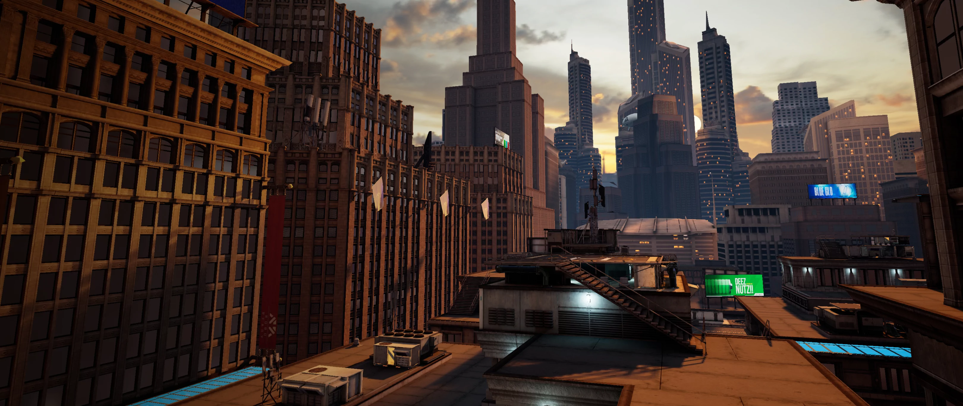
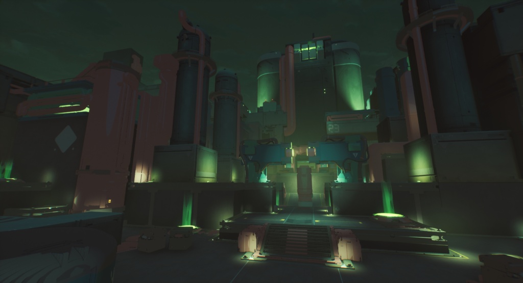
In Powerstation we have some large spotlights pouring color over areas or pointing up to highlights the large towers on two ends of the map along with a thick distant fog that kind of gives it a feeling of a toxic glow.
Can you provide insight into your workflow for creating and optimizing 3D assets for the game’s environments?
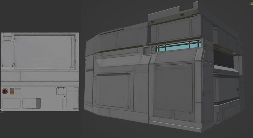
We had some unique ways of working on certain things. Some buildings I went a more traditional route where I painted a number of tileables and trim sheets, then meticulously UV mapped the meshes to those textures. This enabled me to get a lot of detail on buildings without having to use too many materials, often texturing whole buildings with one texture. Other pieces we build out of meshes using materials with triplanar mapping with tileable textures, so we could put a bunch of meshes together and have them look unified.
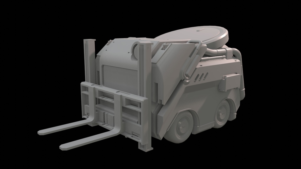
In my personal modelling workflow there’s a lot of booleans, just going wild cutting shapes out of shapes with other shapes. I embrace N-Gons and ya know if you gotta you can just triangulate it and adjust from there. It’s usually a personal choice when I am deciding whether something should have more of the visual be carried by the geometry or the texture. I like having large flat areas.
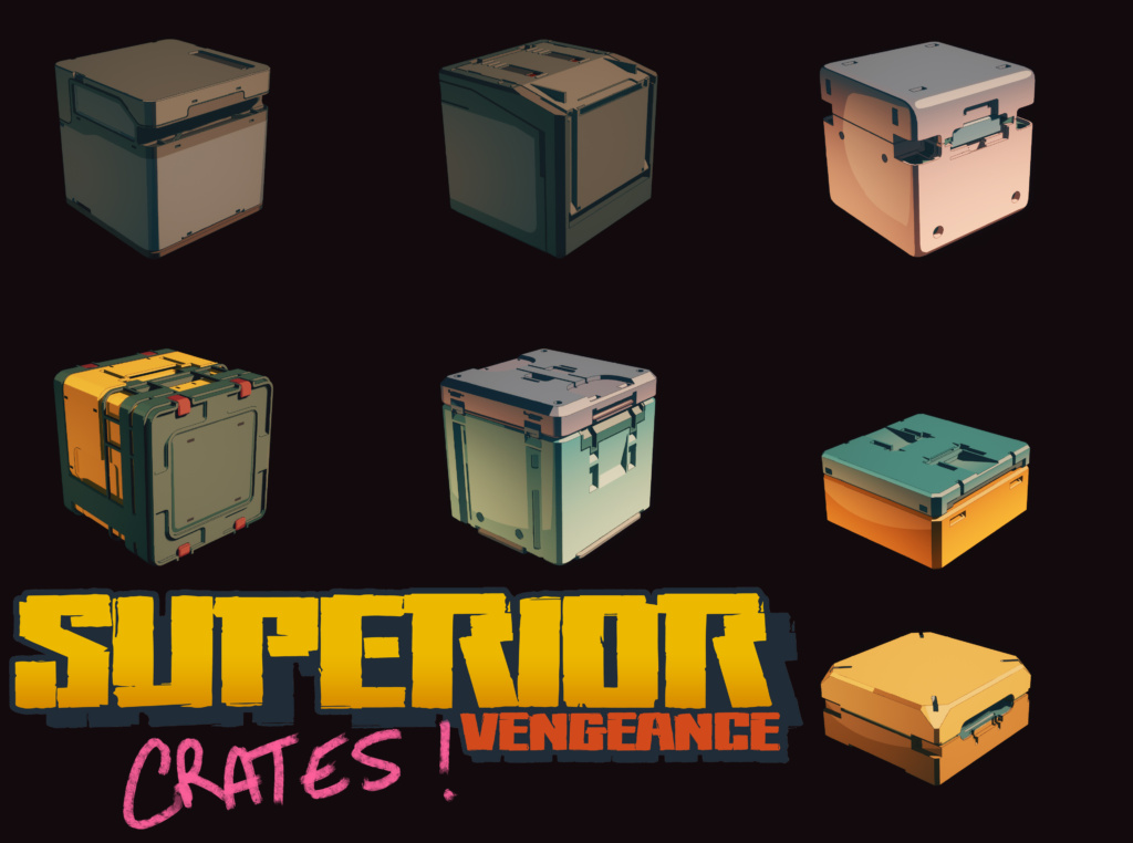
Something really cool we did was use basic flat color on the toon shaded meshes. This allowed us to use textures that are essentially swatches of color that we can mask and change the color of. A huge upside to this is it cut down on UV time, I could build a crate (and I built a lot of crates) and decide this whole part is going to be red, then select the parts that will get that color and just do a quick projection, and just draw that UV shell to where the material will be red. No worrying about stretching or anything.
I’m not any kind of optimization master. I just like to think of my meshes and how they will be seen in the world and design how much should go into it. Making decisions like “will the players ever see this close enough to warrant rounding out these edges, or can I get away with a simple bevel or even a hard edge.
What tools and software did you primarily use for environment design, modeling, and texturing?
I do my modelling in Blender, and will use Zbrush when I need to sculpt something. For Superior: Vengeance, a lot of my textures were just done in photoshop as I prefer that for hand painting, but I also did some using Substance Painter. Some early buildings were even painted on in 3D Coat. I tried to not have too many programs in my workflow because I don’t want to have to be jumping back and forth.
Another application I love to use is PureRef, great little app to drop a bunch of reference or concept art into and keep up on one monitor while I work.
Can you share any specific environments or areas within the game that you are particularly proud of, and what makes them stand out to you?
The Offworld ship and surrounding area is something I am pretty proud of, its just huge when you’re in the map and something very interesting to see as you walk around. If I had to show one screenshot of something I made for the game it would be that.
The Hero Dome is a small boss arena map that I mostly did by myself, with some help from concept, and Powerstation is another favorite because it’s dark and moody. There’s also a gas station I built pre-production that I am still pretty fond of.
Finally, what advice would you offer to aspiring environment artists looking to work in the gaming industry?
Consume art: watch lots of movies, read lots of books, watch anime, listen to music.
Find art that you find appealing and think “what about it is so interesting to me?”. Think about why the artist made some of their decisions.
Find something you like to do environment wise and really work on it, but don’t neglect other aspects. It’s good to be well rounded, but I think it’s important to know what you like to do, and if you are good at the things you like you get to do it more.
Keep up on techniques and processes used in modern games, understand how things are done. You don’t have to master everything. I found that I learned so much on the job, even if the job wasn’t to make the things I wanted to make I was still learning the hard skills and learning visual design.
You can see more of Andrew Severson’s work on Artstation: https://www.artstation.com/andrewseverson
